Lists allow you to populate autocomplete, select, radio, or checkbox form elements with a reusable list of options.
Lists function the same as Dynamic Lists; however, they do not require an API to be created and instead can be created in the platform.
TABLE OF CONTENTS
- Custom List
- Freshdesk Fields
- Lists Menu
- Always Display Option
- Dynamic List
- List Images
- SharePoint List Column
- Salesforce Picklist
Custom List
Custom Lists can be created directly in the form for any radio button, checkbox, select, autocomplete or checklist elements. This requires you to add a label and a value. Optionally, you can also add a colour or image when the options are displayed as buttons (checkbox, radio button only).

When Custom Lists are added in this way they can be duplicated to other elements.

Freshdesk Fields
Instead of entering your own list of options, you can also pull options from your Freshdesk integration.
For more information on that, check out the Freshdesk Integration article.
Lists Menu
To create a predefined list of options, open the Advanced Tools > Lists.
When creating a list, you can either manually add your own options or you can upload a CSV. The benefit of adding a list to the Lists menu is that if the list is updated, all forms using that list will automatically be updated to include any new changes.
To copy a list to another environment, you can use the "copy to environment" button. This will display a checklist of all other environments. Simply select the environments you want to copy the list to and click copy.
If a list is used in a Private form, then the list will only be accessible by authenticated app users. If the list is used in a Public form, then it can be accessed by any form or app user without requiring authentication. You can see if a form is Private or Public by viewing the icon in the bottom right of the List card.
List CSV example
You can find the CSV attached to this article. After uploading the CSV, you can also add images to that list.
When uploading the CSV file, ensure that the first two columns are labelled "label" and "value" respectively, as displayed in the example below.
Always Display Option
For Autocomplete elements, if you want to ensure there is always an option visible despite what the users type into the input, use the Show "Always Display" option. This will enable an additional configuration for your options, allowing you to configure what should always be displayed.

Dynamic List
If you want to pull your list of options from an external source of truth, please check out the Dynamic List article.
List Images
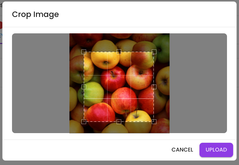
When displaying a list as buttons, users have the option to upload an image to a list; this appears as a camera icon next to the colour selector:

This feature allows them to crop and resize the image before uploading, ensuring it appears as a thumbnail when they use the form.

SharePoint List Column
To learn more about the SharePoint Integration, click here: SharePoint Article
If you are using a SharePoint integration, capturing form data in a SharePoint List and want to allow the form user to populate a SharePoint list Choice column, then you can use the SharePoint List Column integration.
To do this, configure the SharePoint Site, SharePoint List and select the SharePoint choice Column you would like users to be able to select. From here, you can also test the integration to ensure the correct list items are coming through by clicking the text button in the SharePoint Column input.

Once the SharePoint list is configured, it will function the same as any other list. You can assign it to user-select elements in the form and then even map that form element to your choice column in the SharePoint: Create List Item workflow event.


Salesforce Picklist
To learn more about the Salesforce Integration, click here: Salesforce Article
If you are using a Salesforce integration, capturing form data in a Salesforce object record and want to allow the form user to populate an object picklist field, then you can use the Salesforce Picklist integration.
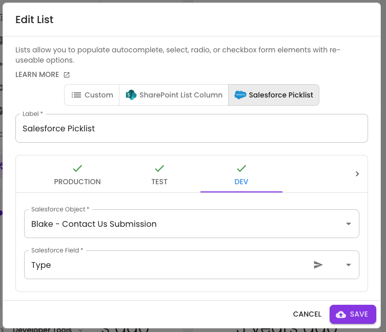
To do this, open the Lists menu in the Advanced section of the side menu. For there create a new list and choose the Salesforce Picklist option. Select your Salesforce object and the and the Salesforce Picklist field. From here, you can also test the integration to ensure the correct picklist items are coming through by clicking the text button in the Salesforce Field input.

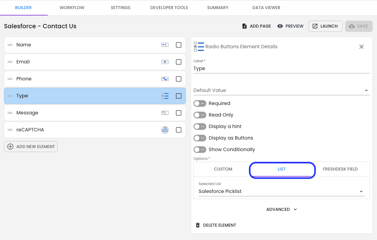
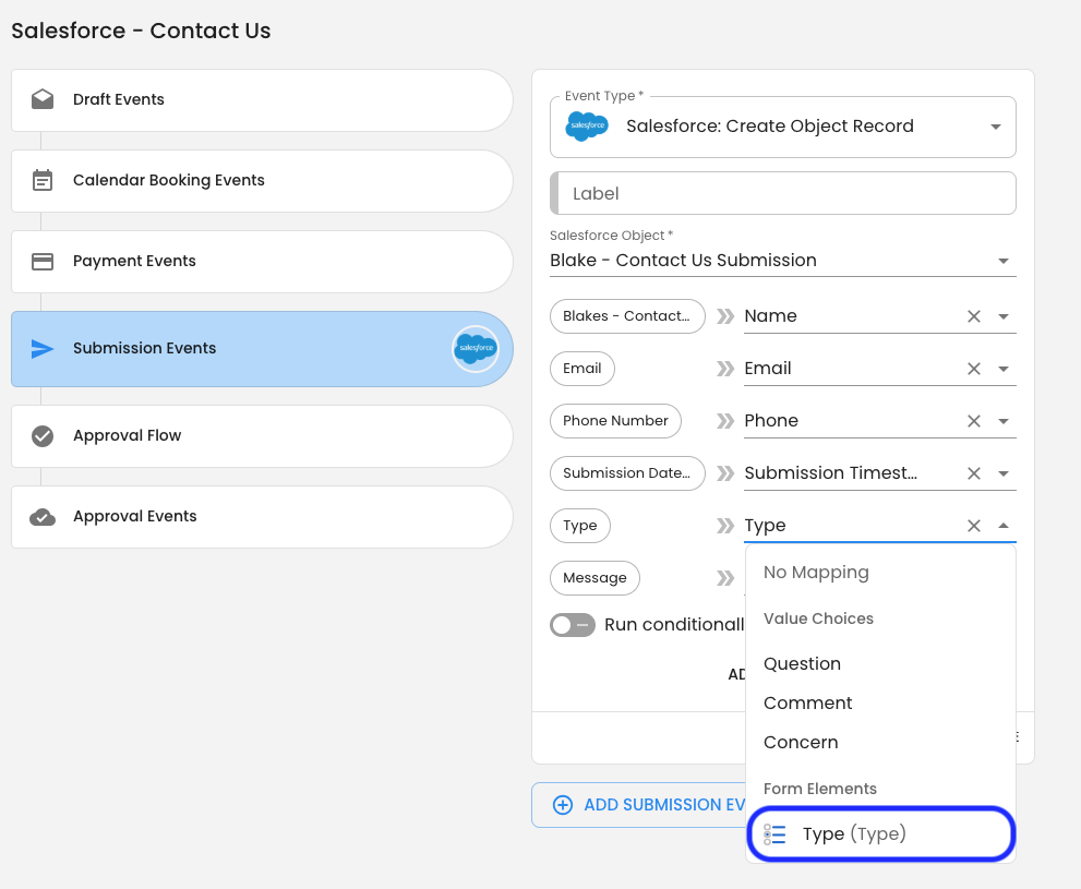
Once the Salesforce list is configured, it will function the same as any other list. You can assign it to user-select elements in the form and then even map that form element to your picklist field in the Salesforce: Create Object Record workflow event.


Get Help
If you have any questions or would like assistance with setting up your lists, please contact us via this support portal or email support@oneblink.io. We are happy to assist in any way we can.
Was this article helpful?
That’s Great!
Thank you for your feedback
Sorry! We couldn't be helpful
Thank you for your feedback
Feedback sent
We appreciate your effort and will try to fix the article
